
Novel
Open-source Notion-style editor with AI autocomplete
| About | Details |
|---|---|
| Name: | Novel |
| Submited By: | Toni Kutch |
| Release Date | 3 years ago |
| Website | Visit Website |
| Category | Open Source GitHub Notion Productivity SaaS |
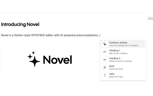
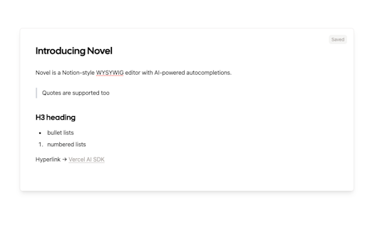
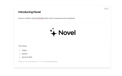
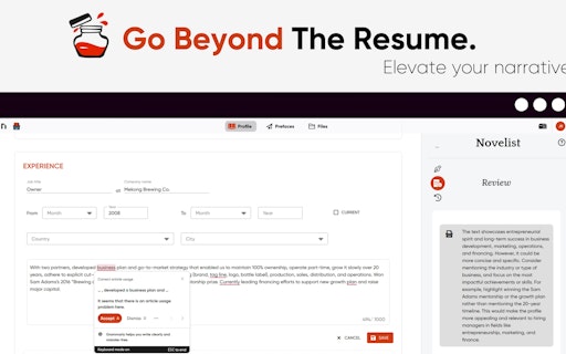
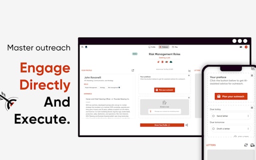
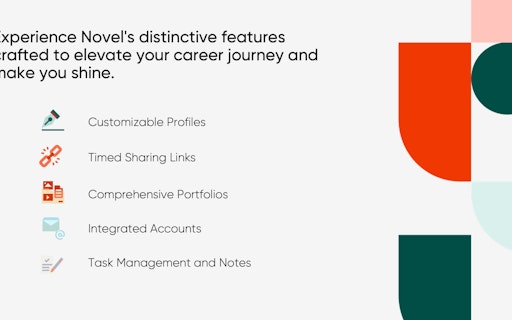
Novel is an open-source Notion-style WYSYWIG editor with AI-powered autocompletions ✨ Built with Next.js Tiptap, OpenAI, and the Vercel AI SDK: https://sdk.vercel.ai/docs
I really like this! Although if you advertise a online-profile creator thats user-oriented, I would try to keep the UI/UX concise on all pages, not just the app itself. Just some quick UI thoughts for the landing page or website in general: - I would try to keep your contents width streamlined. At least on larger screen sizes. On my 27 inch monitor you have very varying degrees of widths for all your sections (Not sure if I am allowed to post screenshots). Example: Your "Take Command"-section has a completely different width than your following "Shape - Go Beyond"- section. That will look unbalanced. That continues throughout your landing page. Its completely fine to limit the width of some sections, but having that many different widths will make an unorganized impression. For a tool that promotes a usecase for CVs and professional profiles, this can shape the early user impression in a less than stellar way. My suggestion: Use one fixed width for your header, "Take Command"-, and "Shape your Story"-sections to make your layout look more cohesive. - That previous point also ties into the navigation. On larger screens it sits dangerously close to the browsers borders. I would try to use a bit of padding to give it more breathing space and align it more with the rest of your layout. Again, layout cohesiveness will make a better impression. Its ok to stretch your navigation wider than the rest of your content, but having it crammed into the corners may raise some eyebrows. - Your visual language (icons, illustrations, colors) doesn't match at all times. I think that can impact the impression your brand makes on people. I would find an icon and illustration set that really looks similar, so your branding looks more concise. For example: Your "Empowering you..."-icon grid further down the landing page has a completely different icon style than the previous sections. I would keep it in line with your illustration style. Same goes for the Pricing page which has another completely unrelated and different icon style. - That feedback also applies to the colors. Keep them to a specific color scheme to promote brand cohesion. Right now, copy and icons don't always follow your main color scheme. For example: Your header headline uses #383838 while your other headlines use #000. My suggestion: Use one color for headlines, unless its signaling a call to action or promotes something really important. Changing the color immediately from header to the following sections will look strange. Fonts, icons, colors, it all forms one brand. And if you just mix and match assets in completely differing style guidelines will have a mess of a branding on your hand later on. I would address this early rather than later. You have a good grip on it here on ProductHunt, where most of your screenshots/previews follow a specific branding. I would try to find a similar handle on your website. Sorry for just wailing on the criticism! But I really think there is room for improvement for your initial presentation. Your app interface looks fine to me, but that level of guidelines - either in UI or UX - should be applied to your website as well. Its the first thing people (your potential customers) see and they could sense that the layout/design/structure of your site extends to your app as well and could form a negative opinion regarding the quality of your product.
2 years ago
Congratulations on your new product release! I can tell you put a lot of hard work and effort into it.
2 years ago
Congratulations on the launch. Haven’t used it yet but the idea seems really interesting 🚀
2 years ago
That sounds like a really exciting project! Congratulations on creating novel.sh! Having an AI-powered autocompletion feature in a WYSIWYG editor would be incredibly useful for many people.Keep up the great work!
2 years ago
This is an extremely interesting idea! Revolutionising CVs was long awaited. I can't believe that we are still using those word documents/ pdfs to tell the story of ourselves. Congratulations on your launch!
2 years ago
Related Apps
-
 Aizolo
Access ChatGPT, Claude, Gemini, Grok, and other leading AI models in one subscription.
-
RivalLens
Monitor competitor websites, track changes, and uncover strategic insights.
-
Flick
Flick turns your inbox into a finite swipe deck: one decision per email, then you're done.
-
 Chat by Copy.ai
A smarter ChatGPT to help you get more done
-
 Reiki by Web3Go
All in one AI agents creation and monetization platform
-
 Guidde AI
Create video documentation instantly with the magic of AI
-
 Jobright AI
Your AI job search copilot
-
 Kombai
A new AI model that you can prompt with UI designs
-
 Amie
AmieThe joyful productivity app
-
 Findr
FindrSearch all your apps, at once