
Venngage Color Blind Simulator
Create accessible designs that everyone can appreciate.
| About | Details |
|---|---|
| Name: | Venngage Color Blind Simulator |
| Submited By: | Jackson Fisher |
| Release Date | 3 years ago |
| Website | Visit Website |
| Category | Design Tools Web Design Inclusivity |
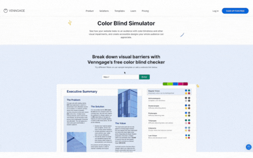
The Venngage Color Blind Simulator allows you to see how your website looks to an audience with color blindness and other visual impairments, and create accessible designs everyone can appreciate. Break down visual barriers with this free color blind checker.
Very cool! So many people talk about the issue and so few have an awesome solution. Well done! I'm looking forward to looking into this
1 year ago
Cool app — a small note though, that logo looks so much like the Airmail logo.
2 years ago
Yo. Congrats on the launch of your startup on the Product Hunt! 🔥 It looks fantastic!
2 years ago
This is really impressive and simple to use... I like it! It takes all of a few a seconds to see in which cases of color blindness someone might actually struggle to see the most important parts of your page. And rather than overhaul anything, you might just need to make a few tweaks to be wholly accessible. It's just a bit of extra work for a brand, but heaps of helpful to the individuals being accommodated. What a great step towards design + accessibility!
2 years ago
This is such an important tool for ensuring designs meet accessibility standards, and creating more accessible designs for everyone. 👍
2 years ago
@ivonna_cabrera Congratulations on the launch of Venngage Color Blind Simulator! It's a great way to break down visual barriers and make sure that everyone can appreciate the website. Well done!
2 years ago
Working on a design or website and want to check for accessibility? At Venngage, we created a Color Blind Simulator to help you test it out. It can be difficult to imagine what color-blind people actually see if you don't suffer from color blindness. Breach the gap by adding the link to our color blind simulator and try out the different filters: Achromatopsia, Deuteranopia, Protanopia, Tritanopia, Cataracts or Low Vision. If your design is inaccessible, you may alienate your audience — both those with visual impairments and those conscious of accessible needs. Connect with your audience using accessible, color blind friendly palettes.
2 years ago
Great addition Team! I love that you're always trying to make things more inclusive for everyone! Keep up the awesome work
2 years ago
Related Apps
-
 Dora AI (Alpha)
Generating powerful websites, one prompt at a time
-
 Mobbin 2.0
Discover real-world design inspiration
-
 Wegic
WegicThe first AI web designer & developer by your side
-
 Framer AI
Start your next site with AI
-
 WebWave
Ditch the grids, create websites like you design graphics
-
 Typeframes
Video creation for makers
-
 STUDIO AI
The new age design tool with WebDesignAI inside
-
 LogoFast
Make beautiful logos with AI, fast & free
-
 Motiff
AI powered professional UI design tool
-
 Creatie
The one-stop product design tool amplified by AI